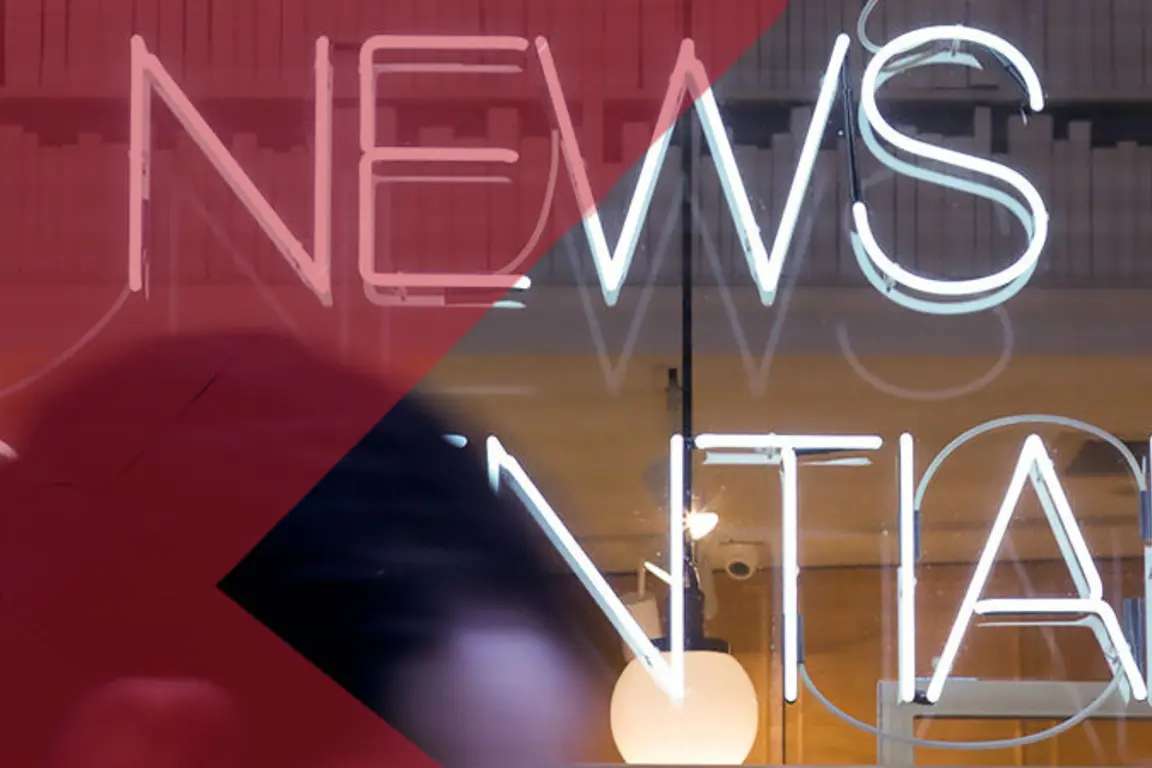
The importance of colour can’t be underestimated across our three venues. When we launched the Fusion Wing at Engineers’s House in Bristol, splashes of colour were used in everything, from the furniture to the signage of each new meeting room.
We went for bright tones, mainly in the red area of the spectrum, known as warm colours, which include pink, orange, yellow and red.
These warm colours evoke emotions we associate with learning and development, such as excitement (red), energy (yellow), wisdom (purple), enthusiasm (orange) and kindness (pink). Whereas, seeing the colour green has been linked to more creative thinking, which is why our Bristol venue also has a green forest mural across one wall of its new break-out area.
Most psychologists view colour therapy with skepticism, pointing out that the mood-altering effects of colour may only be temporary. But when planners use our venues for training and events, we only have a short-term window with which to help them stimulate, set the right mood, and influence delegate performance.
At Woodland Grange in Leamington Spa, we brighten up delegate days by also ensuring our food and snack stations are bursting with colour and freshness.
Apart from sweets and cakes, foods that are strong and bright in colour are generally more healthy for us. These foods have high quantities of vitamins, minerals and antioxidants, they make us feel better, look better and live longer. The salad bar at Woodland Grange is a colour palette that van Gogh would be proud of.
On the sweets and cake front, we recently debuted peach-coloured muffins laced with white chocolate, as part of our grazing stations. Their sweet peach tones evoke feelings of wanting to seek knowledge, engage in conversation and be socially at ease.
Many restaurants use pastel versions of orange, such as apricot or peach in order to help increase people’s appetite and promote conversation and social interaction, which in turn encourages diners to have a good time and to eat and drink more.
Pi
Stronger shades of pink, like fuchsia, have been linked to confidence and energy. Our overall brand colour is linked to hope and optimism, plus the positive aspects of traditional femininity like nurture and kindness. These are themes that are not only sit well for meetings and event planners, but also underline the importance we place on wellbeing, both for staff and delegates.
Of course, everyone’s feelings about colour are often deeply personal and rooted in experiences or culture. For example, while the colour white is used in many Western countries to represent purity and innocence, it is seen as a symbol of mourning in many Eastern countries.
So the next time you start to feel anxious in a yellow room or more powerful when driving a black vehicle, consider that this temporary mood may be due to the colours we’re exposed to.
Personally, seeing Amanda wearing her pink socks in London, walking past the green forest mural in Bristol, and sampling a colourful tasty treat in Leamington Spa, always makes me smile and is sure to brighten up someone’s day - after all, isn’t that the most important thing?
